Wednesday 21 May 2014
Context Publication // Publication product shots
Here is the final printed version of my Context publication, it has actually come out quite nicely considering it was a bypass tray job, but the prints are clear and the visuals and binding of the book has worked well. I was limited with my stock choice so resorted to Library antique white again as i was impressed with the outcome of my Leeds alphabet publication.


Tuesday 20 May 2014
Context Publication // Completed design
Final Design Context Publication design and layout.
This publication is a journey of Designers, studios and photographers that have inspired me the most over the last 3 years at LCA, certain examples have been used for specific inspiration for individual briefs but overall a majority of the people featured in this publication are constant sources of inspiration or have influenced me in some way.
This publication is a journey of Designers, studios and photographers that have inspired me the most over the last 3 years at LCA, certain examples have been used for specific inspiration for individual briefs but overall a majority of the people featured in this publication are constant sources of inspiration or have influenced me in some way.
Monday 19 May 2014
Leeds Alphabet // Concept boards
This has probably been the most enjoyable brief of the year for me, I have enjoyed all the aspects of it and i'm really happy with the result, both of the alphabet, the photography and the publication, It has inspired me to try to do more of these style of briefs in the future, where I get to use all these different kinds of tools and formats to create a piece of design
ben from ditto inspired this design and I have learnt a lot through doing it.
ben from ditto inspired this design and I have learnt a lot through doing it.
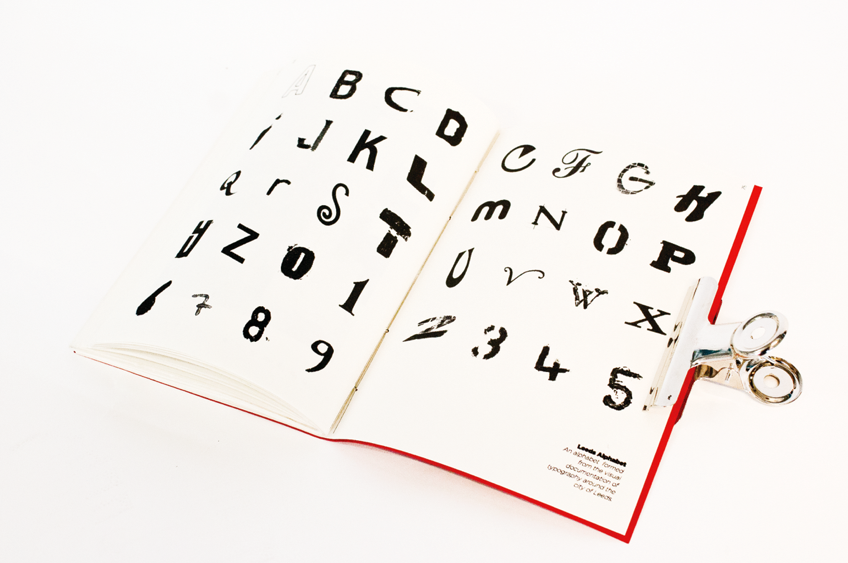
Leeds Alphabet // Publication Product shots
I am not happy at all with the produced outcome of the publication that I have made, I have chosen the wrong binding technique for the amount of pages I have and I have found that the centre pages protrude out of the book and produce an untidy finish. However, I still really like the quality of the prints and think the acutal printed visuals of both the photography and the letters looks really nice and works well together.
I have printed the publication on Antique white paper, which is matt and not grainy so the printed finish is really good, even though it did take 4 hours to print because of problems with the digital printers in the digital dungeon but I am glad I put the time in, but i am still going to get it professionally printed as i think this brief deserves a nice finish.
As you can see below here are a few product shots of the final publication, these have actually come out well, much nicer than I expected to get from that publication.
Sunday 18 May 2014
Leeds Alphabet // Finished publication design
Here is the final layout and design of the Leeds alphabet publication I have decided to produce it landscape as I think this produces a good layout for each double page spread and allows the viewer to clearly see the letter, information about where the letter was found as well as the original photograph that was used to extract the letter form from.
Leeds Alphabet // Publication Layout and design
This will be the standard layout of my publication, I have designed the booklet as a landscape format, I think is quite a nice aesthetic and allows a double page spread to focus on just one letter form.
I think once printed out this format would be quite a nice feel to flick through and you get both the individual shape of each letter as well as the contrast of texture and colour that comes with each photograph.


I think once printed out this format would be quite a nice feel to flick through and you get both the individual shape of each letter as well as the contrast of texture and colour that comes with each photograph.
Subscribe to:
Posts (Atom)